Lets see some of my research and understanding.
Balance
Unity and variety
Rhythm and Repetition
Scale and Proportion
Dominance
Static and Dynamic
Balance

Balance can be equal amount in terms of size, shape, volume, weight, etc...
There are symmetrical balance & asymmetrical balance.
Symmetrical Balance (Formal)
Symmetrical Balance is basically mirror image. Which means, when you fold the image into half, it is identical in each part.
For examples of symmetrical image:
Faces


Unity & VarietyThere are symmetrical balance & asymmetrical balance.
Symmetrical Balance (Formal)
Symmetrical Balance is basically mirror image. Which means, when you fold the image into half, it is identical in each part.
For examples of symmetrical image:
Faces
Models need have symmetrical face, to create perfection and beauty.
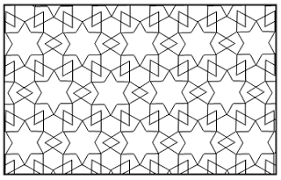
Patterns
Patterns created my Muslim artist, it consist of tessellation.
To create this pattern, it require mathematical geometries.
Most of the pattern design are symmetrical, it have the feeling of harmony and pleasant looking.
Architecture
Even in architect also created a symmetrical building.
It had been said that symmetrical architecture are important.
You can see that, most of the parts/things in house/building are symmetrical, like: front gate, door, window, tables, chairs, etc...


Left: Holy Rosary church in Brickfields; Center: Chinese Temple, Meanam; Right: Mosque Taj Mahal, Agra India
In olden days, place for prayer like church, temples, mosque and so on are mostly build in such a way that are mirror image.
Nature
Nature that are surrounded by us also consist of symmetry element. Like, insect, animal and plants.
My paper cutting for symmetrical balance:
.jpg) |
| Is gemini ! My horoscope... |
Asymmetrical Balance (Informal)
"Asymmetrical balance occurs when several smaller items on one side are balanced by a large item on the other side, or smaller items are placed further away from the center of the screen than larger items. One darker item may need to be balanced by several lighter items."(Skaalid)
A
Asymmetrical balance I can say that is apply almost in every piece of art or design. It can be in the form of colour, value, shape, position, textual, eye direction, etc...
It is very important to have balance in a piece of artwork/design.
Here's my paper cutting for symmetrical and asymmetrical:
 |
| Is also gemini, but is asymmetrical. |
Citation : Skaalid , Bonnie. "Design Theory: Classic Graphic Design Theory Principles of Design: Balance." Web Design for Instruction. he University of Saskatchewan, n.d. Web. 10 Nov 2012. <http://www.usask.ca/education/coursework/skaalid/theory/cgdt/balance.htm>

Unity is like unite the same "kind" into a group. Unity might give a oneness feeling, because of the repeated pattern, shape or colour. Variety often being said a spice of life, because of the different things being together. A unified work is likely to be boring if it has no variety. Variety can make a contrast within unity in a piece of work. This will make a piece of work looks more interesting.
Look at the bottom example:
Unity versus Verity
Which one create a more interesting design? To me is verity...
 VS.
VS. 
Let's see some design or fine art that have the combination of unity & verity.
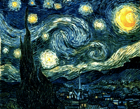
Starry Night by Vincent Van Gogh(1889)
This is an interesting and famous piece of fine art work.
As you can see, his combination of unity & verity had created some movement within the picture.
NEXT...

"Black Arm & Face Unit" Ben Jones
Look~! Can you see what makes it looks interesting ?
The unity are the hands and faces.. variety are the pattern and the hand gesture.
When it combine together, it looks interesting.
Here's my unity and variety paper cutting:
 |
| although different element are being apply over here. But you can see that I unified everything in one piece. |

Haha... I put the heartbeat gif!?
Is because it have a strong element of rhythm and repetition.
Just feel so interesting about it, somehow I have the calm feeling when looking at it.
Is like "I'M STILL ALIVE" that kind of feeling. If your work have consist of rhythm with repetition, it will give you a kind of enjoyment/excited feeling.
Here are some picture that consist of strong rhythm & repetition:

Look at this, the trees are repeated. Is just that the placement are different "up" to "down". It makes the structure of wave were rhythm are being use. It give LIFE to the picture.
Another great example:

Look at this man, it just make me so happy.
I don't know why, this sculpture somehow makes me feels like I'm flying (woohooo~~)
My paper cutting !!
 |
| Swimming towards the lotus ... |

I had a lecturer who teach us still life drawing, he always said that scale and proportion are very very important.
Why is scale and proportion are important?
I can said that is widely used in mass media, especially advertising!

See how the advertiser play with the scale and proportion They put the image as the largest to attract the consumers. If the consumers are interested, then the start to look at the big wording. The consumers gets interested and want to know the further information then they will start reading the detail. Now you see how is it important of the scale & proportion in advertising field ?
Of course not accept in advertising, some artist also love to play around with this two element.
For examples:
La Folie des Grandeurs II painting- Rene Magritte
I won't say is off of scale/proportion, is like the artist "break the rules" I can say.
Some how it looks interesting.
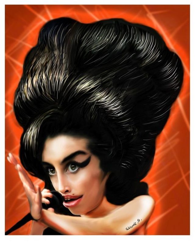
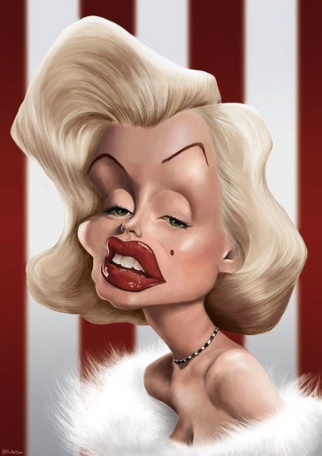
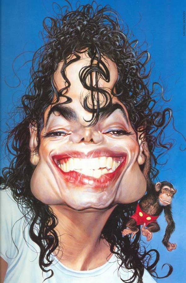
This is another great example. A caricature art, pop art!
Looks funny in a way, but it brings out that characteristic of a person.
Looks so COOOOOOL~~~~!
http://izismile.com/2009/04/22/great_caricatures_44_pics.html
My version of scale and proportion in paper cutting~
 |
| The word "喜" means happy... I uses this to compose scale and proportion. |

Now is dominance. How you feel about it?
I feel like: "Oh yeah~ I'm da BOSS here!"
Dominance can be explain in such a way that the object is different from the others, SPECIAL!
Either in size, colour or value.
Also can be mention as emphasis
Some examples below:
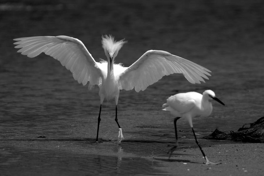
Which one your eyes focus on first?
The bird with the wings widely open right..
The memo is the dominance, because of the outstanding colours.

Same goes to this, the sun/light is the dominance.
My lovely paper cutting..
 |
| Mother pig and five piglets. So cute. haha~ |
I can't really combine them into one. So I'll just explain differently.
Static
Static composition are majority of lines on a page are horizontal or vertical. Static composition also makes use of symmetry to denote perfection, rule and order.
For example:

the line are form horizontally and repetitively giving the feeling of calmness.


This is static movement that are form vertically with a hit of dynamic illusion.
So this is how I compose my "static" on paper cutting
 |
| Yes~! is chess... I compose it in horizontal way. |
Dynamic is the opposite of static. it uses many diagonal lines. Diagonals are somewhat unsettling, which results in a sense of movement, energy, excitement that generates from a dynamic composition.
Lets see some examples.

The sense of dynamic occurs in the image because of the diagonals shape are being use. It causes movement and energy in the image.

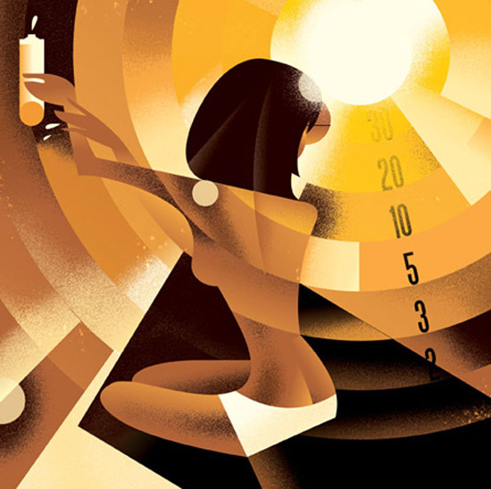
This is some illustration by Mads Berg. His curvy lines are unsettling that he manage to create the dynamic feeling.
Now look at my work:
Lets see some examples.

The sense of dynamic occurs in the image because of the diagonals shape are being use. It causes movement and energy in the image.


This is some illustration by Mads Berg. His curvy lines are unsettling that he manage to create the dynamic feeling.
Now look at my work:
 |
| Is more simple and direct on how I show the dynamic movement. |
.jpg)
No comments:
Post a Comment