Pages

Saturday 15 December 2012

Shadow Art 2

Here's another shadow art I wanted to show you.
This one is like completing an image.
Is done by one of the Japanese artist(Kumi Yamashita) , but he lives and works in New York City.
Her light and shadow works are impressive

Origami
Origami
2011
H366, W366, D1cm
Creased Japanese paper, single light source, shadow
Commissioned by American Express, New York City USA
Chair
ChairChair
2010
H110, W50, D15cm
Carved wood, single light source, shadow
Private collection
A-Z
A to Z
2011
H183, W427, D10cm
Carved wood, single light source, shadow
Akari
Akari
2009
H90, W90, D15cm (Mother) H45, W45, D11cm (Child)
Sculpted wood, single light source, shadow
Perfe Takiyama Maternity Clinic, Tokyo, Japan
Seated Figure
Seated Figure
2008
H91, W91, D10cm
Sculpted wood, single light source, shadow
Private collection
Pathway
Pathway
2008
H183, W150, D10cm
Aluminum with cut-outs, single light source, shadow
Commissioned by Seattle City Light, Washington USA
Feather
FeatherFeather
2006
H100, W100, D10cm
Sculpted wood, single light source, shadow
Commissioned by Akiru Municipal Medical Center, Tokyo, Japan.

Clouds
Clouds
2005
H200, W120, D10cm
Cut aluminum plate, single light source, shadow
Commissioned by Stellar Place Sapporo JR Tower, Hokkaido, Japan.
City View
City ViewCity ViewCity View
2003
H250, W500, D5cm
Aluminum numbers, single light source, shadow
Commissioned by Namba Parks Tower, Osaka Japan.


There is still many more of her works, visit her webpage http://www.kumiyamashita.com/

Sunday 2 December 2012

Shadow Art 1

Recently there is a lot of people/artist are getting into shadow art that are so amazing. This topic I going to talk about are how those people/artist using rubbish to create image by using the light with various material.

When they created the sculpture using various material, you wouldn't able to figure what object is it. Until the light are shine to the sculpture, you can see the shadow image of the object.

Here are some picture that I wanted to share with everyone.
This shadow artwork were did by Timothy "Tim" Noble and Susan "Sue" Webster (tim noble and sue webster), are two British artists who work as a collaborative duo, and are associated with the post-YBA generation of artists.

Youngman,
YOUNGMAN, 2012
1 wooden stepladder, discarded wood, light projector
338.5 x 58 x 213.5 cm (1331/4 x 225/6 x 84 in)
The
THE INDIVIDUAL, 2012
1 wooden stepladder, discarded wood, light projector
299 x 69 x 193 cm (1173/4 x 271/6 x 76 in)
The
THE GAMEKEEPER'S GIBBET, 2011
Solid sterling silver gilded in pure gold, metal stand, light projector
71 x 42 x 160 cm (28 x 161/5 x 63 in)
Self
SELF IMPOSED MISERY, 2010
1 wooden stepladder, discarded wood, light projector
78.5 x 403.5 x 224 cm (31 x 1587/8 x 883/16 in)
Dead
DEAD THINGS, 2010
Trilogy to the Facts of Life, 1
1 black cat, 19 crow heads, 4 rook heads, 5 jackdaw heads, 13 crow legs/feet, a pair of crow wings, a pair of jackdaw wings, 6 juvenile black rats, 1 x chaffinch (male), metal stand, light projector
Dimensions
Tim: 29 x 49 x 165 cm (112/5 x 194/5 x 65 in)
Sue: 37 x 76 x 160 cm (143/5 x 30 x 63 in)
Wild
WILD MOOD SWINGS, 2009–10
2 wooden stepladders, discarded wood, light projector
Dimensions:
Tim: 178.5 x 110 x 167 cm (701/4 x 431/4 x 653/4 in)
Sue: 215 x 98.5 x 130 cm (843/5 x 383/4 x 511/5 in)
Cold
COLD DEATH 2009
Trilogy to the Facts of Life, 3
3 brown rats (juvenile), 3 brown rats (adult), 1 mink (front and rear halves), 1 carrion crow (full mounted), 7 carrion crows (head/neck), 8 carrion crows (legs/feet, 2 wings), 8 rooks (head/neck), 12 rooks (legs/feet), 11 jackdaws (head/neck), 8 jackdaws (legs/feet), various animal bones, metal stand, light projector
Dimensions
Tim: 50 x 47 x 162 cm (193/4 x 181/2 x 633/4 in)
Sue: 50 x 55.5 x 152 cm (193/4 x 22 x 594/5 in)
Dark
DARK STUFF, 2008
Trilogy to the Facts of Life, 2
189 mummified animals (67 field mice, 5 adult rats, 42 juvenile rats, 44 garden shrews, 1 fox, 1 squirrel, 1 weasel, 13 carrion crows, 7 jackdaws, 1 blackbird, 1 sparrow, 1 robin, 1 toad, 1 gecko, 3 garden snail shells), glue, metal stands, light projector
Overall: 73.5 x 47.5 x 161.5 cm (29 x 143/4 x 633/5 in)
Tim: 38 x 37.5 x 161.5 cm (15 x 143/4 x 633/5 in)
Sue: 37.7 x 37.5 x 153.5 cm (144/5 x 143/4 x 601/2 in)
Nasty
NASTY PIECES OF WORK, 2008–09
2 wooden stepladders, discarded wood, broken tools, light projector
Dimensions, two parts:
166 x 86 x 171 cm (653/8 x 337/8 x 673/8 in)
156 x 101 x 191 cm (613/8 x 393/4 x 751/8 in)
HE SHE
HE/SHE, (Diptych) 2004
Welded scrap metal, 2 light projectors
HE: 96 x 148 x 185 cm (374/5 x 581/4 x 724/5 in)
SHE: 100 x 186 x 144 cm (392/5 x 731/4 x 562/3 in)


There are many more, visit there website for it .

Tuesday 27 November 2012

Batik

We went for the Batik Workshop in KL along with the January batch this morning.

Detail
Address: 30, Jalan Inai, Off Jalan Imbi, Kuala Lumpur, 55100 Wilayah Persekutuan, Malaysia
Time: 9am to 3pm
Price: RM85 ( including lunch)

When we arrive there, we got a mini workshop about the making process of the batik. Before we went there, out lecturer require us to do some research. So that it is easy for us to do our batik on that day without thinking much.

So here is what we have to do
Requirement

  • 2 dimensional design pattern. 
  • some of tessellation designs. 
  • Either mental recollection or bring along a sketch or sketch on the spot. 
  • Only this time we are using batik and full colour.
This is the first time I'm doing batik. A little nervous. So before I arrive I already think that I will draw a bird with many tails. Then the ground will have simple leaves tessellation. Finally added a droopy flower.

Process
I started using a pencil and drew it on the silk fabric that they had ready for us. Later on, I used the wax and trace along the lines that I had drew. Lastly added colour.

Final
Here is my final out come before washing off the wax.

And here is the final after washing off the wax.
We did not wash the wax off, is because we are running out of time. So the workers over there help us to wash it and put it nicely in a simple frame, cover it with plastic, then send it back to us on the next day.


Friday 9 November 2012

Tessellation

Tessellation are mainly symmetric designs which can fit together in repetitive patterns like simple jigsaw puzzles.Tessellation are usually a 2D plane, without gaps or overlaps. Tessellation commonly can see it at brick walls, tiled floors and walls.

The beginning of tessellation
It started off from Spain in Alhambra, during the 14th century on tiling. Their tiling are made of coloured tiles forming patterns, many truly symmetrical, geometrical and beautiful. Some were not tessellations because they didn't cover a surface with a repetitive design without gaps or overlaps. However, many of the Alhambra's patterns were true tessellations. The Alhambra artists made many beautiful tessellations long before Escher was born, but Escher made tessellation art much more popular.

Example of Alhambra's tessellation :


M.C Esher tessellation style
  • He define tessellation as "the regular division of plane"
  • Repeating shapes or patterns that cover a surface without gaps or overlaps
  • Make designs with people and animals instead of stiff geometric shapes
My final result for tessellation


Figure and Ground
Motif: Liquid
Size: A2                                     Colour: Black and White
Medium: Poster Colour              Surface: Watercolour Paper

Criteria
  1. Symmetrical
  2. Rhythmic
  3. Dynamic/Static
  4. No gaps
Closure
Motif: Wheel
Size: A2                                Colour: One Colour and White
Medium: Marker Pen             Surface: Watercolour Paper

Criteria
  1. Symmetrical
  2. Rhythmic
  3. Dynamic
  4. No gaps
Proximity
Motif: Face
Size: A2                                Colour: Grey
Medium: Photocopy              Surface: Watercolour Paper

Criteria
  1. Symmetrical
  2. Rhythmic
  3. Dynamic Perspective/Indicating Dominace/Emphasis
  4. No gaps
Similarity
Motif: Sweet Smelling/Smooth
Size: A2                                Colour: One Colour and Black
Medium: Colour pencil           Surface: Watercolour Paper

Criteria
  1. Symmetrical
  2. Contrast
  3. Dynamic/Static
  4. No gaps/No Overlaps
Continuity
Motif: Fractal
Size: A2                                      Colour: Two Colour
Medium: Colour pencil and Glitter  Surface: Watercolour Paper

Criteria
  1. Symmetrical
  2. Rythmic/Movement
  3. Dynamic
  4. Contrast/Static
  5. No gaps/No Overlaps
Continuity
Motif: Fractal
Size: A2                                  Colour: Three Colour
Medium: Colour pencil             Surface: Watercolour Paper

Criteria
  1. Symmetrical
  2. Repetitive with Intervals
  3. Contrast
  4. No gaps/No Overlaps

Thursday 8 November 2012

Movie Review

Watching movie = having class ???
YES! We are having class outside the classroom.
Sounds fun right ?
Actually there is a purpose for us to do that.
Our lecturer ask us to find a place to watch movie so that we can do our project.
The project that we going to do is creating a comic only using silhouette.

Everyone decided to watch movie at Subang Parade, arrive there at 3pm.
Right after our social psychology.
So I rush there. When I arrive, no one was over there.
So I decided to buy the ticket first. I pick FrankenWeenie to watch.
It suits the project well. I thought might be a few watching the movie.
Sadly, I watch alone in the end.
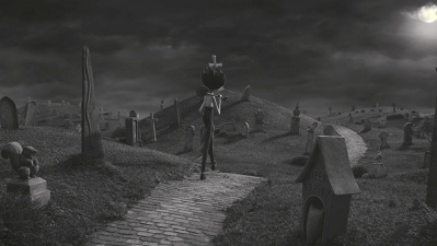
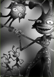
FrankenWeenie


FrankenWeenie is directed by Tim Burton. Before I watch this movie, I thought it was going to be a very boring movie because it is in black and white. After watching this movie, I was impressed!! When I start blogging, I did some research about this movie. This movie was made using stop motion. I was so shocked because it seems to be so natural and digitalize.

Synopsis about this movie...
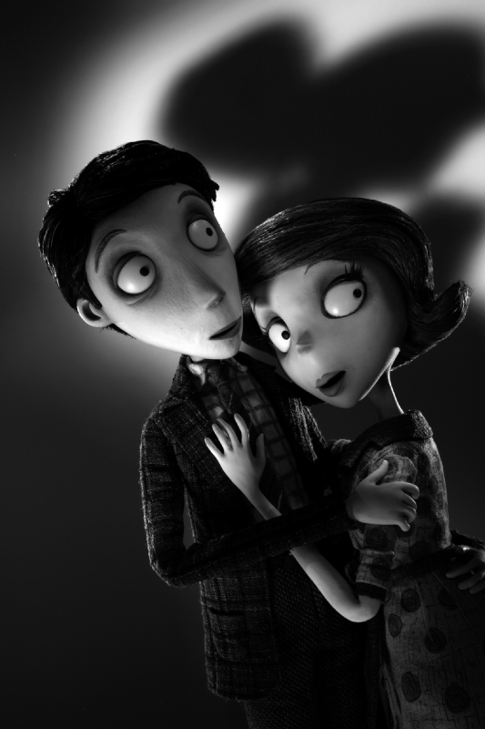
It is about a young boy named Victor, he loves his pet , Sparky a lot. Almost everyday Victor spends time with Sparky. One day, Sparky got into a car accident because Sparky chased the baseball which was hit out of the court by Victor . Sparky pass away. Victor was so sad. He hope that he could bring Sparky back to life. One day, his new science teacher taught the class about electric impulse. The teacher did an experiment about the electricity that was being applied to the dead frog and the frog react towards the electricity. Victor immediately had an idea to bring his pet  alive. He conducted an experiment using the power of lightning. His experiment succeed but he could not tell anyone about it. If someone knew about it, they might misuse the experiment  the experiment do not have confirmation yet. One day, his classmate, Edgar found out about this experiment. He threatened Victor to tell him the secret, he had no choice but to tell him. Unexpectedly, Edgar told this to most of his classmates. In the end, something bad happen. The classmates took their died pets back to alive, but the pets turned into zombies. The classmate got frighten and asked Victor for help. Victor tried his best to help them. The problem solved in the end, but he thought Sparky was going to die again because Sparky was caught in a fire to fight with one of the monsters. In the end, Sparky came back alive. Everyone was glad about that.

So basically that's the synopsis.
There is a lot of interesting part in this movie.
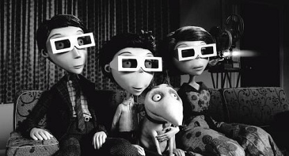
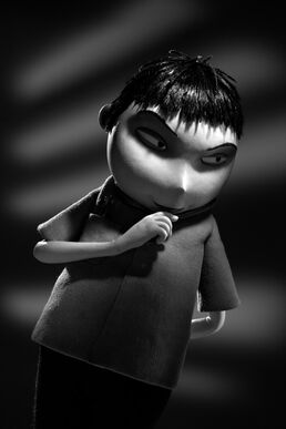
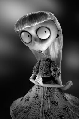
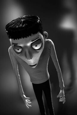
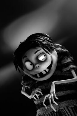
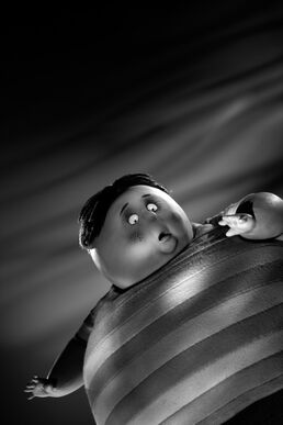
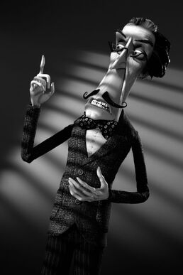
Character Design:
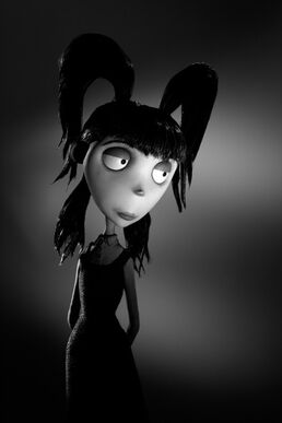
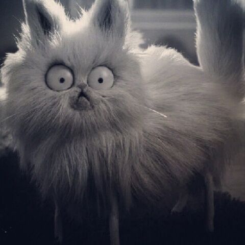
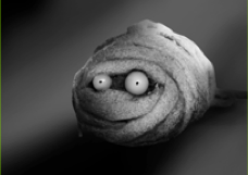
Look at those characters, they basically have the same characteristic, long and skinny arms and legs. Their iris are just a dot. To bring the characteristic out of the character, they enhance certain part of them, like their eyes, nose, hair, tummy, teeth and finger. By just enhancing certain part of the character, you already able to guess their characteristic. Amazing right?
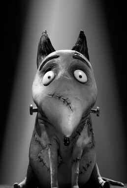
 Elsa Van Helsing.jpg 888 DS TOSH ANI TK07-1330369146.jpeg Frankenweenie-Weird-Girl-portrait.jpg Frankenweenie-Nassor-portrait.jpg Frankenweenie-Edgar-portrait.jpg 888 DS BOBB ANI TK05-1330082723.jpeg Frankenweenie-Mr-Rzykruski-portrait.jpg  

Pets Design:
Lets move on to the pets design. Almost the same that happen on the pets. their legs are extremely tiny, it doesn't seems to be able to support their body. Except the poodle are a little different. To differentiate the animal type. Just look at the fur and skin surface.
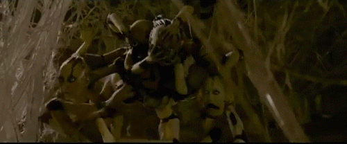
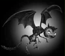
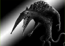
 Sparky.jpg File:Mr Whiskers.jpg 

Monster Design:
huhuhu~ now is the transformation to evilness of the animal. Feels a bit like Ultraman monster.
I like how the vampire can being combine with the bat. Most of the pets transform larger and evil with sharp teeth.
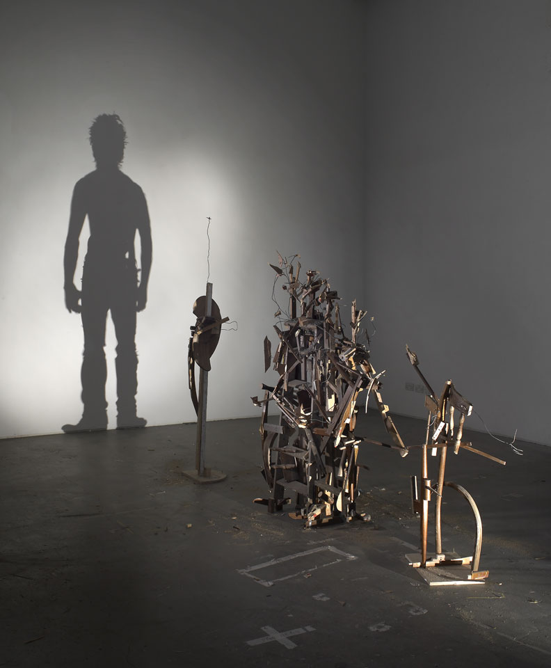
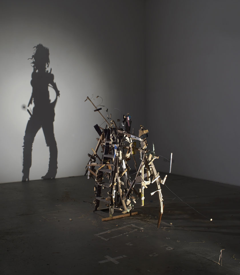
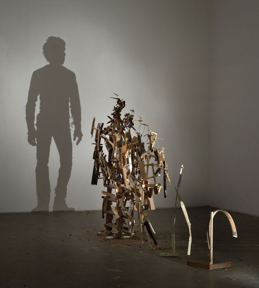
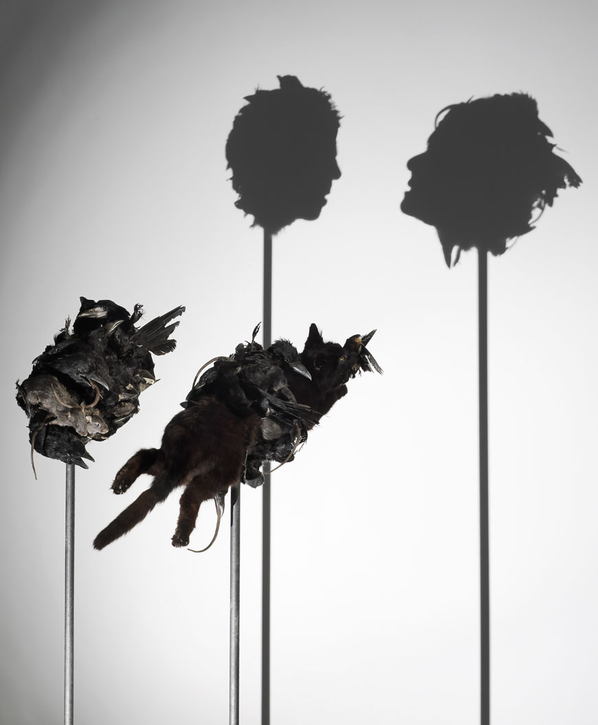
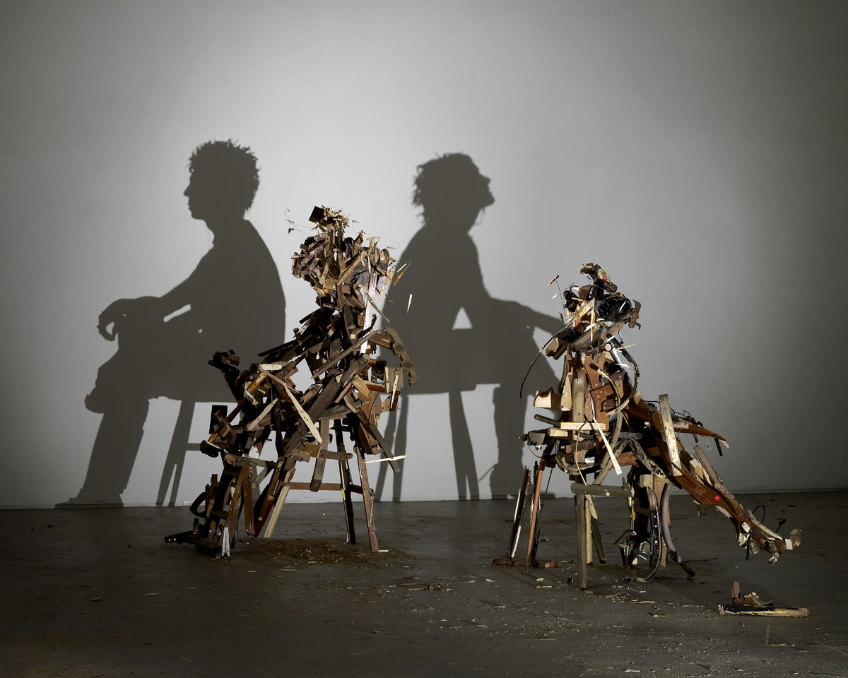
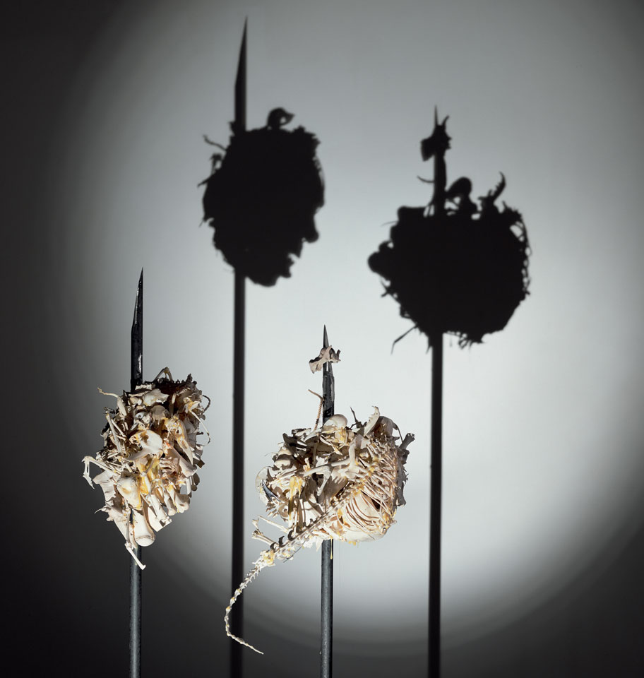
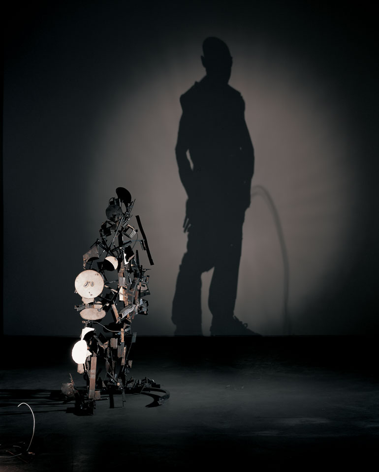
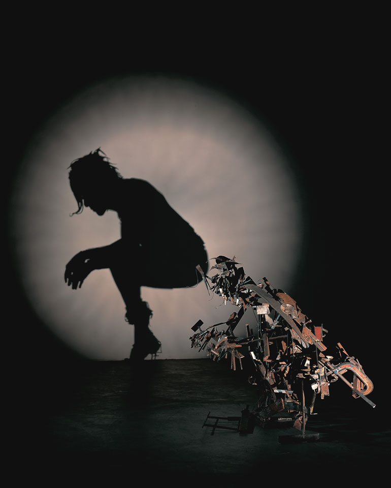
Vampire cat.png Wererat.png Mummy hamster.png Turtlemonster.png Sea creatures.png

Shadow:
Showing the shadow place an important role of making us think differently from what we expect.
Or we are able to predict what is going to happen.
The shadow some how makes us think negatively.
Although the shadow are form flat onto a surface, I still can predict the distance between the object.
  

The grey tones:
The grey tones are so amazing. When I'm watching it. I can feel like I am watching it with colour. It somehow trick my eyes. It makes me guess too.

Space use:
The space that are being used are just something that we can imagine in our daily basis.
The experiment did by Victor, he uses a lot of D.I.Y concept in it.
     

That's about it for FrankenWeenie.

So after the FrankenWeenie movie ends, I rush to Summit and watch Silent Hills Revelation with my boyfriend. He ask me to watch this with him. I was fine, since I am doing it for the purpose of study with better understanding to do my next assignment. I did not watch the other part of the Silent Hills before, but luckily the movie is not that confusing. What I heard from some other classmate, they said that silent hills is actually a game. At first when I saw the trailer at the Subang Parade cinema, I thought is an adventure movie. After I watch.... WAHHHHHHHHHH~ horror movie. Is not to said scary, but it shocked me !!!

Silent Hill


This movie is directed by Michael J. Bassett. He brought a stepped into the terrifying world of video game-turned-movie franchise Silent Hill with his latest film.

Short sypnosis :
"Heather Mason and her father have been on the run, always one step ahead of dangerous forces that she doesn't fully understand, Now on the eve of her 18th birthday, plagued by horrific nightmares and the disappearance of her father, Heather discovers she's not who she thinks she is. The revelation leads her deeper into a demonic world that threatens to trap her forever." Written by Anonymous

There's a few things interesting in this movie were how the character are being design and the character characteristic and the space being used.

Lets look at the character first:
The character are mostly a form of hybrid with human, animal and insect.
Which created a creature or alien
      

Next, the space that are well being used in the movie.
I like how the way they put the creature movement into the space. Is nicely plan and organize that the it makes the environment so creepy.
     

So this is roughly about the movie that I understand. Now have to start working on my silhouette study and out come.