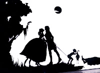
Her art works are very narrative, although is a bit violent. The way each character that she created in her artwork are very interesting. The features are being enhance, in order to bring out the silhouette. This is what I wanted to create the look on her by bringing her face features out first.



This is her original image

Later on, I liquify her face looking more like an "alien".
 |
| 1. I used bloat tools to bloat the eyes 2. Then I used pucker tools to shrink the nose and mouth 3. I adjust the face using forward wrap tools to make it looking more like and alien. 4. I make the face slimmer using forward wrap tools. |
 |
| Looking like "ET" now. |
 |
| by doing this, I'll have better effect at my wording later. |
Cover the layer, if not the wording won't be able to see, because have to use white text to do the effect later.
Next... Is time to add the wording/text on the the face.
 |
| 1. Duplicate the artist face 2. I used pen tool to create the path. 3. later on, I used the horizontal type tool. 4. When the icon is placed at the path tool, it will automatically change to path type tool. |
 |
| This could take up a few days time to finish it. (Looking suitable words for this artist) |
 |
| This how it looks like after I done the texting. 1. Convert all the text to rasterize type at the layer. 2. Adjust the text (edit - transform - warp) according to the face to get the best fitting. 3. Once done, merge all the text layer. |
 |
| 1. Create a new layer 2. Ctrl + backspace to create a black layer as backgound 3. Put this layer below the text and the duplicated of artist. 4. Arrangement should be duplicated layer of artist on the top, below is the typography layer then the black layer. |
 |
| 1. Right click on the duplicated layer of artist, click "create clipping mask" 2. Here's how it looks like after you done this. |
(this method I learn online)
The flaming hair~ at first I wanted to put her art work on to her hair and also used the clipping mask method to do it. I realize that it doesn't work, because of her black hair will blend with the black background. I have no choice but to do the flaming hair.
 |
| 1. Duplicated the artist image again. 2. Desaturate the image 3.Now invert the colour by pressing Command + I. |
 |
| 1. Duplicate the layer from above. 2. Then apply the find edges filter 3.Next, invert the colour and change the Blending Mode to Hard light. 4. Then here's the result I got. |
 |
| 1. Duplicate from the layer just now. To have stronger line. |
 |
| 1. Put in the flame image. 2. blending mode change to screen to remove black background. |
 |
| 1. Duplicate a few layer of the fire until the whole hair is covered. 2. Now merge all the layer from the starting of doing the flaming hair process. |
 |
| 1. Now at layer mask to he flaming hair layer. 2. erase the face off. |
 |
| 1. Show the typo layer, and this is what I got. 2. I Used dodge tool and burn tool to adjust the image |
So here is the final outcome
 |
| Final result KARA WALKER ~~ |
After I hand up... My lecturer said that she doesn't looks like a artist. I make her looking more like a model. I was all down at that time. Haizz... never thought of this point. I just thought that bringing her face features out instate of what she have done. I thought of doing this because looking at her art work is almost similar, but after thinking of what the lecturer said... I guess what he said was right.
My fault too... consulting the lecturer last minute. Haha... no excuses for this time.
My fault too... consulting the lecturer last minute. Haha... no excuses for this time.


